Shapes in Graphic Design: What They Mean and How to Use Them
Have you ever seen a logo that just felt a certain way? Some logos feel confident and professional while others feel playful and friendly, and the reason is the way they’re designed. The art of graphic design is about communicating visually; instead of using words, you use colors, layout, and — as we discuss here — shapes to speak through only images.
Like individual words, shapes also represent distinct ideas, and people interpret them without even knowing it. When we see circles, squares, triangles, etc., they elicit predictable reactions in our subconscious. While most people aren’t consciously aware of what these images mean, they feel it all the same; and that’s why some logos feel one way or another.
Graphic designers, however, understand the meanings of shapes all too well, and use this code to more strategically communicate the right messages for logos, websites, advertisements, or whatever else the job calls for.
In this article, we’re going to crack their code so that anyone can use it. Whether you’re a professional designer looking to brush up your skills, or a beginner trying to make the most out of your social media posts, you can find some advanced graphic design tips below to bring you one step closer to your goals.
Circles
One of the most classic shapes is also one of the most popular in graphic design for its strong connotations. To understand the meaning of circles, you first have to understand one of the basic tenets of optics: the human eye instinctively follows lines. With that in mind, because a circle is a line that never ends, it represents both movement and completeness. In graphic design, that opens the door for a lot of uses.

Photo from Pexels
As borders or frames, circles — and other circular shapes like ovals and ellipses — represent both unity and protection. Lacking any sharp or jagged edges (which we explain below), circles are a much friendlier shape than the others for encompassing other images within. Because they tend to “invite” the viewers into their “completeness,” circles exhibit a strong sense of community. For these reasons, they are one of the most popular choices for logos, or at least to frame logos inside them.
As decorative shapes, such as background decoration or building blocks in other images, circles are playful and graceful, and put viewers at ease. Circles never stop, and so neither does the eye when viewing them, giving them a childlike whimsy.
Spirals
Regarding the principle about how the eye naturally follows lines, spirals take that principle to extremes. They maximize the effect of a circle “drawing you in,” almost hypnotizing the viewer by keeping and holding their attention.
Photo from Wikimedia
Spirals have a powerful effect in graphic design, and so should be used carefully. They’re visually “busy,” and so they counteract images that strive to be calming or easygoing. They’re also highly magnetic, so they tend to compete with any other nearby visuals. On the other hand, when spirals are used alone and are the central focus, they can effortlessly create a dynamic and intense visual.
Squares and Rectangles
Considering their structural integrity, square and rectangles signify stability and, by extension, trust. They are the go-to shape for order and organization, as well as all other traits associated with these, such as logical, calculating, and above all, efficient.
Photo from Pexels
However, as a consequence, squares are rectangles can be a little bland by undermining other attempts to be vivid or fun. Their straight lines present a clear-cut and neatly defined pathway, and so there’s not distraction — the fastest route, not the scenic route. In the business world, squares are rectangles are a favorite emblem of serious industries like insurance or finance.
You can further customize the message rectangular shapes send by tweaking the angles of their corners. While perfect right angles highlight the emphasis on stability, slanting those angles can create interest hybrid shapes, depending on how sharp the corner is (more on this below). This is one technique to make otherwise boring rectangular shapes more exciting.
Triangles & Arrows
When finding the meaning of triangles, the most important factor is which direction the point is facing. Triangles and arrows change their meaning entirely based on whether they’re pointing up, down, left, or right, and blend those meanings for degrees in between.
Photo from Wikimedia
Upward-facing triangles are structurally sound (like rectangles) and therefore symbolize stability and trust. But because the point draws the eye upward, they also represent growth and success, and tend to signify leadership or even domination. Downward-facing triangles are almost the opposite. Because they look like they can tumble at any moment, they represent risk and can cause slight tension, which can be used to intentionally create an edgy visual.
If triangles are facing left or right, it represents progression: either forwards in the sense of moving onward, or backwards in the sense of backtracking or dwelling in the past. Consider the iconic “play” button for videos. It’s worth noting that which side represents which depends on the direction that culture reads; in Western cultures that read left-to-right, a right-facing arrow represents forward progression.
Sharp Edges
When dealing with squares, rectangles, and triangles, the sharpness of the angles also communicates its own meaning. Considering the main rule of optics that the eye follows lines, pointier angles create more eye movement, which translates into a more energetic visual. In excess, this effect can be jarring or disruptive, though, but if that’s the aesthetic you’re going for, extra sharp angles are a perfect fit.
Photo from Pixabay
Likewise, flatter or wider angles are much calmer. They work well if you’re trying to find a good medium between energetic and calm, but if you’re aiming for a truly relaxed look, your best choice is to round off the corners altogether.
Curved Edges
A curvy or wavy line takes the fun and whimsical properties of a circle and applies them to otherwise straight-edges. The severity of the wave — think “frequency” — determines how much eye movement it causes; just like sharp edges, wavy lines with a high frequency can be jarring and disruptive, although not quite as much as pointed edges.
Photo from Pixabay
One of the most useful applications of curves in graphic design is to temper the more serious effects of shapes with hard corners to make them a little friendlier. You see this often in web design, where rectangular buttons are given rounded edges to soften their look.
Curved and rounded corners are a practical graphic design tactic for finding the perfect balance between the serious properties of rectangles and the playful properties of circles.
Parallel Lines
With the way they occupy a viewer’s eye movement, a series of parallel lines largely acts in the same way as a basic shape. What they communicate, though, depends on their direction.
Vertical Lines
Photos from Wikimedia
A series of vertical lines consistently guide a viewer’s eyes up and down, suggesting strength or even aggression. Just like an upward-facing triangle, vertical lines symbolize dominance and leadership, and as such work against more peaceful visuals.
Horizontal Lines
Photos from Wikimedia
By contrast, horizontal lines symbolize stability and balance, like the very ground we walk on. Horizontal lines can be calming and showcase security, with the drawback that they’re a little on the boring side.
Crosses
What happens when you combine a vertical and a horizontal line or two perpendicular diagonals? As you might expect, crosses signify conflict or contrast, which in certain instances could be exactly what you’re going for.

Photos from Wikimedia
Depending on how they’re stylized, crosses sometimes carry external symbolic meanings with them. Vertical-horizontal crosses, for example, are usually associated with religion, specifically Christianity, and may drum up any personal opinions the viewer has. However, they also represent health and hospitals, so you can influence the interpretation with the right context.
Similarly, diagonal crosses may appear as an X, typically associated with restrictive signs. To avoid signifying a “do not” sign, don’t use other images in front or behind the cross — place them in the empty triangles above, below, and to the sides instead.
Like the basic shapes, you can modify the meaning of a cross by adding more visual weight to one line over the other. For instance, if you use a thick horizontal line but a thin vertical line, the cross will insinuate stability and balance primarily, but still retain some of the vertical’s power and aggression. In this way, you can customize the cross design to suit your needs.
Symbol
Sometimes the meanings behind certain shapes don’t have to be cryptic. You can always fall back on universally accepted symbols to immediately and clearly communicate a particular message. With common symbols, an easily recognizable shape is essentially the same as using an actual word.
Everyone knows a heart represents love, for example. If you want to display romance or love, it’s as simple as including a heart in your image. There’s plenty of symbols like hearts, as well — stars represent success and achievement, scales represent justice, clocks represent time, diamonds represent wealth, etc. Keep in mind that these vary depending on the culture: because of a country’s street signs, to some people an octagon represents “stop,” to others a downward-facing triangle.
Animal shapes are especially popular in graphic design for the same reason. Many animals each have their own distinct associations, so you have a diverse arrangement to choose from when finding a specific set of traits to you want represent: a wise owl, a clever fox, and dangerous shark, etc. With graphic design done well, you can even take a common symbol and make it your own, like how a friendly and flighty bird came to represent one of the largest social media sites to date.
Photo from Pixabay
On top of that, symbols also reflect the traits of the shapes that make them up. Returning to the heart example, the two curves at the top display the cheerfulness of circle while the triangular bottom adds the risky excitement of a downward-facing triangle (joy mixed with risk — sounds like romance to me!). You can even personalize your own depiction of the heart by sharpening or widening the sharp angles to create a frighteningly sharp heart or a more plump and playful circular heart.
Abstract Shapes
Above all, graphic design is a creative field, and so it’s not limited to a rigid selection of basic shapes and lines. Instead, designers are free to invent entirely new shapes — whatever they need to serve their purposes.
Do be afraid to create your own abstract shapes. You can use multi-sided polygons, fluid circular blobs, or any mixture in between — you’re the creator, so the only limits are your imagination.
When using abstract shapes, however, keep in mind that the individual aspects you use retain their symbolism from their original shapes. What that means is, if you use the top-half of a circle and the bottom half of a square, you will create an abstract shape that exhibits both the playful features of a circle and the serious features of a square.
Like the square with rounded corners we mentioned above, you can craft an abstract shape to meet whatever needs you may have. Maybe you want to create something the world has never seen before in order to stand out from the crowd.
Photos from Wikimedia
As long as you know what traits you want to keep — in the example above, ERM Power wanted to keep the zestiness of curvaceous lines and the duality of intersecting crosses — you can pick and choose which aspects of individual shapes to use.
Alternatively, you can maximize the effect of a single shape by repeating it. Cloud shapes, with repetitive curves one after another, come off as more playful than an individual circle alone. Repeating shapes essentially accents the characteristics of that shape by overlapping it on itself.
Another idea is to use secondary shapes to create primary shape. For example, an upward facing triangle built entirely out of parallel vertical lines combines the aggressively dominating characters of both to take the effect to heights neither could reach on its own.
Photos from Wikimedia
Once you master the meanings of the basic shapes, you’ll be able to experiment and create completely original designs for whatever you need. Therein lies the true art of graphic design.
How to Apply Shapes with Fotor
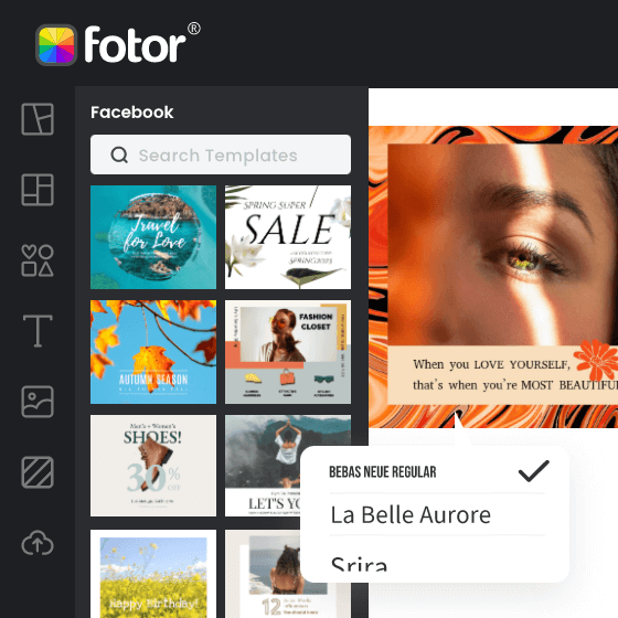
In the Fotor online design tool, you have the options for either designing off of premade templates or creating your own unique shapes.
Powerful AI-driven editing tools like background remover, AI enlarger, object remover, one-tab skin retouch, AI art effects, etc.
Over 100,000+ ready-to-use templates and creative content for graphic design and photo collages.
Millions of HD stock photos for personal and commercial use.
Particularly useful in logo design, our logo template features 39 professionally designed logos to use as a jumping off point. Reshape them, add to them, tweak them, rearrange them, and make them your own. And because most of these templates are included in our free version, it’s the perfect way for beginning designers to learn the ropes.
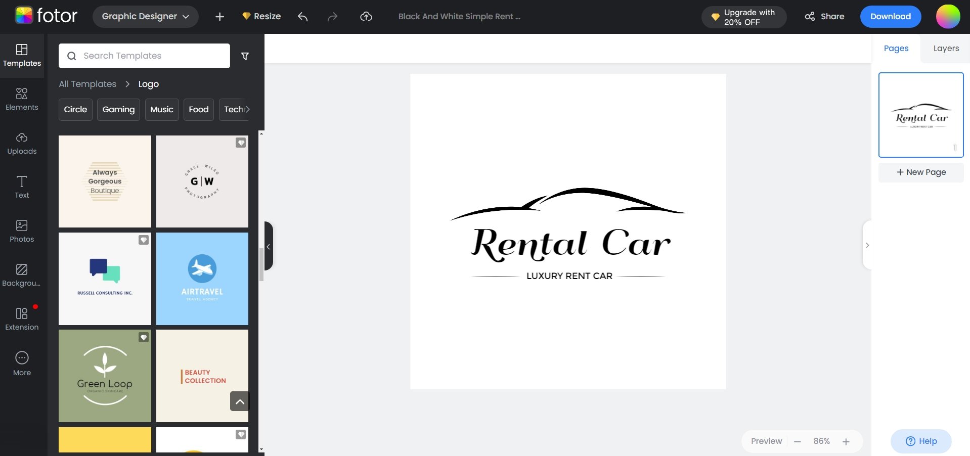
To get an even greater handle on how to make a logo, read our complete logo design guide. Here, a professional designer teaches you the basics of logo design and also runs through how to create a logo yourself step by step.
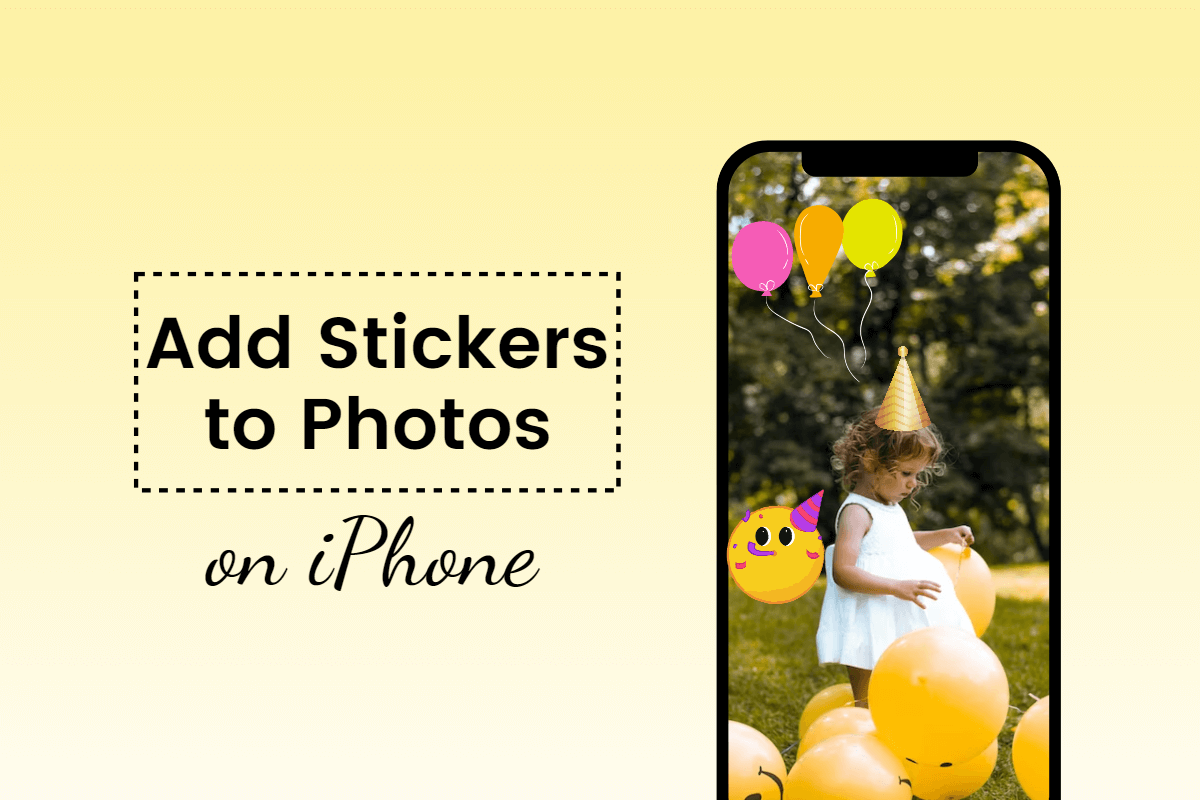
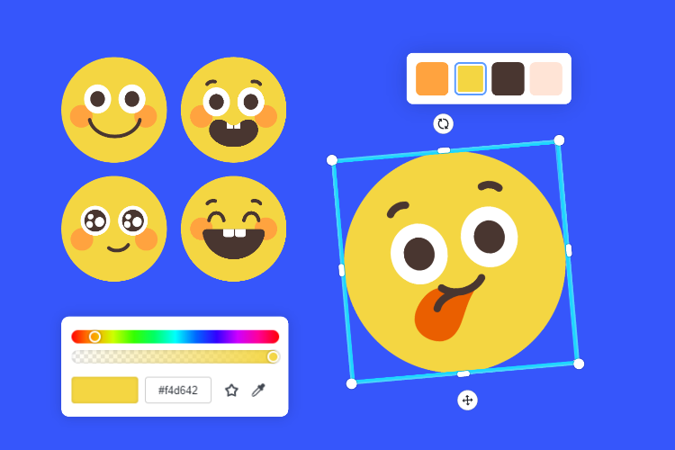
Using original shapes is as easy as choosing the one you want and dragging it on the canvas. After opening a new design file, just click the “Sticker” tab to access hundreds of shapes, both basic and complex. You can even combine, layer, or stack shapes to create something wholly original.
Using original shapes is as easy as choosing the one you want and dragging it on the canvas. After opening a new design file, just click the “Sticker” tab to access hundreds of shapes, both basic and complex. You can even combine, layer, or stack shapes to create something wholly original.
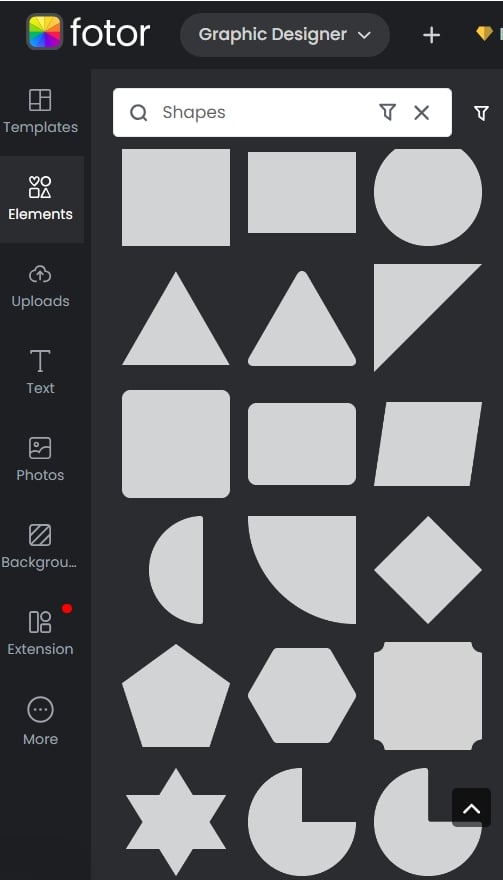
You can also use specialized lines — such as curvy, wavy, and jagged, as mentioned above — to “draw” your own customized shapes within the app. The possibilities are endless.
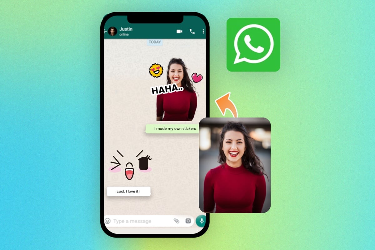
There’s even a library of preset stickers with more detailed graphics, including social media icons, office supplies, and seasonal themes. Just keep in mind the meanings of shapes applies to everything, even preset stickers, so a curvaceous Snapchat ghost sticker still retains the fun and cheerfulness of other circular shapes.
There’s even a library of preset stickers with more detailed graphics, including social media icons, office supplies, and seasonal themes. Just keep in mind the meanings of shapes applies to everything, even preset stickers, so a curvaceous Snapchat ghost sticker still retains the fun and cheerfulness of other circular shapes.
See for yourself with the unlimited standard version! Try online photo editor right now!
