How to Design an Etsy Shop Banner for Your Store?

Howdy, Etsy entrepreneurs! Since almost no entrance threshold exists to enter the Etsy market, an ever-growing number of people have begun to sell their products on Etsy. In the face of so much competition, the question is: how do I stand out from the crowd? Shop banners may be the key. Check out this tutorial on how to create customized shop banners. It’s super easy! Just a few steps and I’ll bet you can master how to make a banner for your Etsy online store in minutes.
1. Good Banners Bring More Sales
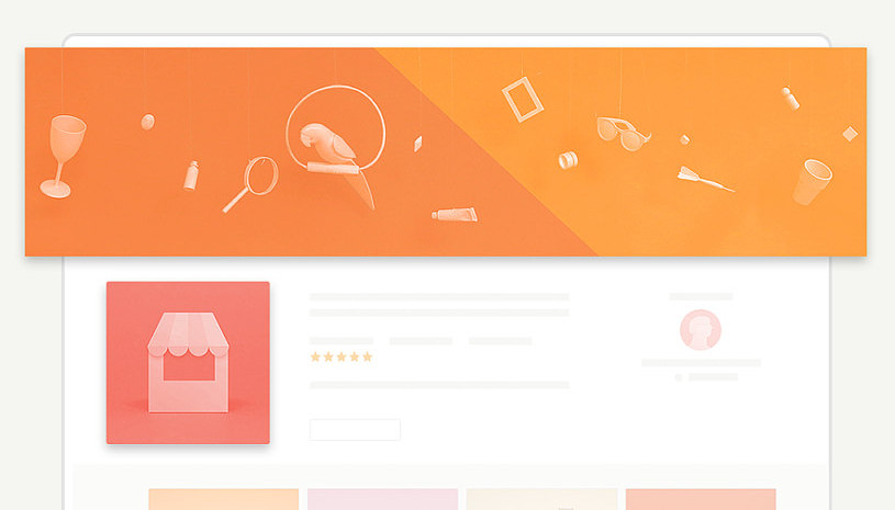
As Etsy shop owners, you may be too busy crafting your wares and don’t have time to design the right shop banner for your home page. Do not overlook its influence on your shop’s overall image, even though it plays little to no role in boosting sales. According to a research article on Psychological Science, in less than one-half of one-tenth of a second, we can draw conclusions about people based on a photo. Whoa! Our brains are definitely quick at judging. No one could deny the effect of how first impressions subconsciously affect people’s attitude towards a person, and this is also applicable to an online shop. Lacking any detail that makes the shop seem off-putting will let visitors make a snap judgment that this owner maybe not too professional. Conversely, having a good banner would subconsciously allow for positive judgments about your image from potential customers and ultimately enhance sales. To appear more professional, you should manage your Etsy Shop Banners properly. Why not add a banner and let it tell a story about your shop that reflects its personality through images?
around.io/etsy shop banner
2. Etsy Banner Sizes
A shop banner is optional. It’s your decision whether to add a shop banner or not. Here are several Etsy shop banners to inspire you. Let’s get started, shall we?
On Etsy, you can choose either a big banner, a mini banner, or none. Both types of banners appear on the top of your shop’s homepage. The third one is the Etsy order receipt banner. It only appears at the top of your order receipts.
- Big Banner (Cover Photo)

A big banner (Cover Photo) has a minimum size of 1200 x 300 px
- Mini Banner

Smallest size for the mini banner is 1200 x 160px.
This means no matter what size your banner is, the width is fixed at 1200 px, and you really only need to make a decision about its height. (FYI: Etsy recommends 3360 x 840 px) Just decide which size suits your shop banner design, and you are good to go!
- Etsy order receipt banner

The Order Receipt Banner only appears at the top of your order receipts. Be aware that the size of the Etsy Order Receipt Banner is fixed and has to be exactly 760 x 100 pixels. It may not affect the buyers’ decision to place an order, but it serves as part of the shopping experience. It’s more like adding a cherry to someone’s sundae. It’s not a necessity but is something you should highly consider adding. You can never predict how it affects the chances for repurchases.
3. Tips & ideas for Making the Etsy Shop Banner
- Text Usage
Definitely, include your shop name on your banner because it serves as a calling card for your brand and makes it even more recognizable than a small icon. One more tip is to include how to contact you in the banner so that potential and current customers are able to reach you. Then you can build up a community of fans on social media privy to continuous updates and freebies. Fonts used on the banner should be readable and be consistent with the theme of your products as well.

Click the image to edit
- Showcase your products
The banner art is a means to demonstrate your bestselling products to potential buyers. We all have experience as a random browser of other online shops: the very first thing we see when we click on the shop is this banner. It would either convince us to scroll down for a bit and take a look at other products or click on the return button because the store wasn’t appealing enough, or it wasn’t selling what we were looking for. It makes browsing more efficient and can effectively attract target groups that are interested in the store’s products. Plus, it serves as an advertisement to visitors.
Who doesn’t love free ads? Don’t miss out on the opportunity to advertise your best product by adding this feature.

Click the image to edit
- Match with your store
As mentioned above, the cover photo reflects a shop’s personality. Thus, make sure the style is consistent with your products’ themes. Imagine that you clicked on a store with a banner with a dark and spooky theme, and you normally would expect it to sell gothic or Halloween party products. That store selling anything other than what that banner ad thematically suggests would throw off anyone who came to visit. No one would think the banner and the products belong in the same store. This hypothetical reveals that it’s essential for the banner to stay consistent with the products and tell the buyers exactly what you are selling. Having a banner with floral arrangements and perfume bottles works great if you are selling homemade fragrances. Others would immediately get an impression of the perfume store upon seeing your banner.

Click the image to edit
Click the image to edit
- Show the deals
Sometimes you can boost sales with discounts, but not everyone notices it before they pay. To promote even more effectively, it’s better to show discounts to more Etsy browsers. Now, the banner can help you inform your clients about the discount. Simply design a banner that includes the discount info, and everybody who visits your store will see.

Click the image to edit
- Simplicity is the Key
It’s always best to stick to being simple. This article has mentioned a lot about how to design a good Etsy shop banner, and your mind may think of some complicated objects and text for your banner. Hold your horses! Remember to keep the design as neat as possible. Think of only one or two items to be emphasized at a time. This will keep you from complicated graphics, long text, and busy backgrounds. After all, all we want is a readable banner that leaves a strong impression. Simplicity is the key.

Click the image to edit
- Keep updating
While it’s great having a hero banner featuring your brand and products properly, the banner is also a huge opportunity to stay relevant for your audiences in terms of up-to-date styles and trends. This is especially true for Seasonal promos, where oftentimes sellers change their style to promote better on special occasions such as Christmas or Mother’s Day. A great place to source seasonal graphics is with our dear friends at Vexels who are packed with Seasonal graphics for your store banner. Stay on your toes and change your banner every once in a while to show your customers that you really care.
4. How to Design Your Etsy Shop Banner with Fotor
Here’s a quick tutorial:
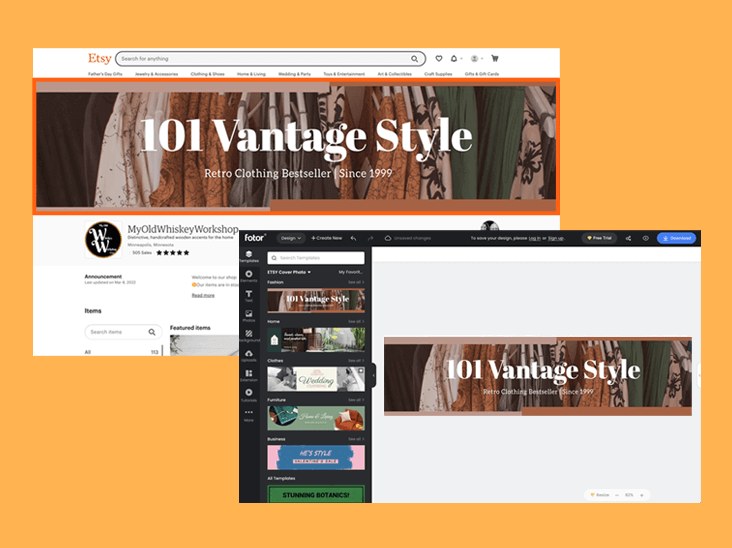
1. Go to the Fotor webpage and click on “Create a Design”.
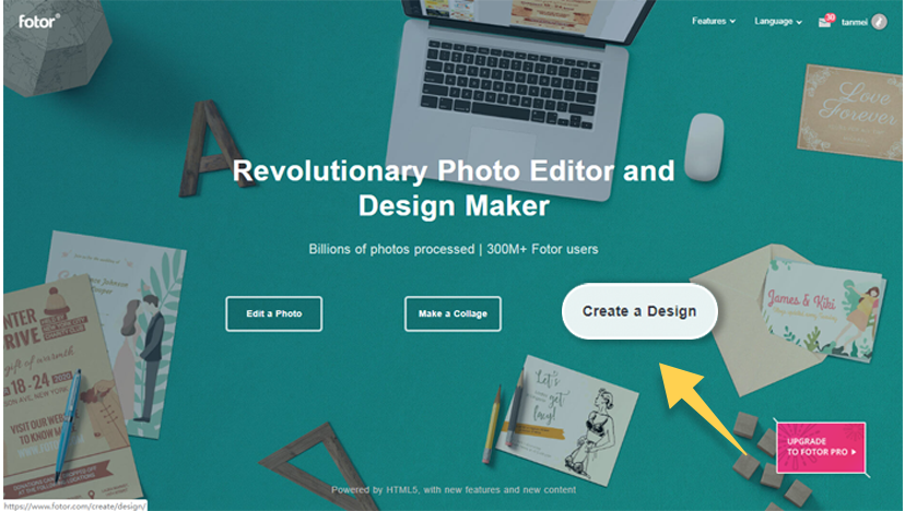
Click the image to create your design
2. Click on the “Etsy Cover Photo” under the category “Marketing”.
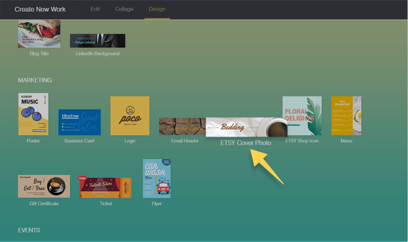
This should be the size of a big banner (1200 x 300 px). If you want a smaller banner, try custom size (1200 x 160-300 px)).
3. First, start by picking a background.
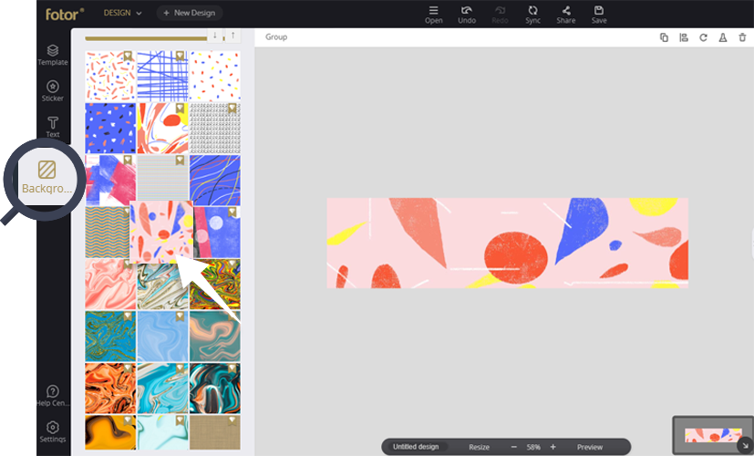
Second, click on “Text” to add words and change the font wherever you want to.
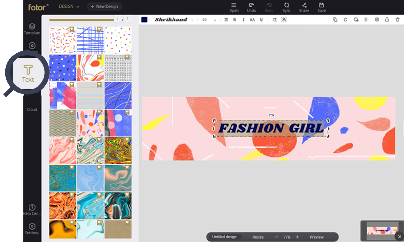
Third, choose “Sticker” and add whatever stickers you like.
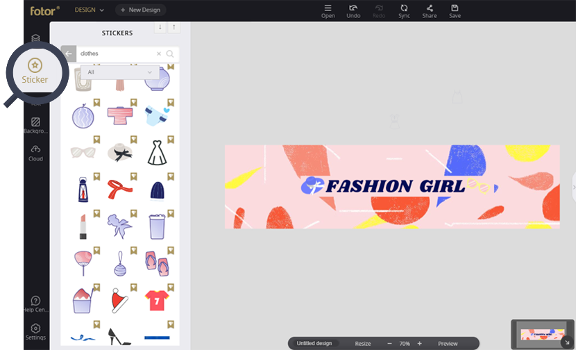
Have fun with mixing and matching the stickers, colors, and fonts until you’ve created your desired design. OR if you’re short on time: Use our templates and alter it into your personal style.
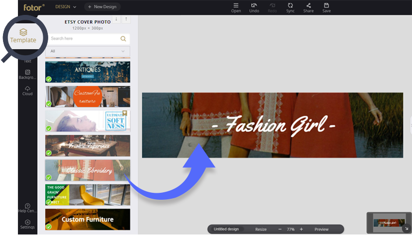
4. When your shop banner is done, save the image in high quality as a .jpg or .png (Etsy accepts most common formats like .jpg/.png).
5. Question Time:
1. Should I add my shop icon to the banner?
It depends. As your cover photo appears on the same page of your shop icon, one icon should be enough. Only when your text on the icon is too small should you enlarge it to make it readable. It is recommended to put part of the icon on the banner but not the exact same icon. To avoid replication and remain consistent, you may only enlarge the shop name with the same font and use the same elements on the icon to decorate the banner.
2. Can I make the Etsy Order Receipt Banner with Fotor as well?
Yes! You can. Just follow the same steps for making the shop banner but start with a different size (760 x 100 px). And one more thing, this serves as a thank you note to your customers, so make sure that you show your gratitude in your design.
3. How to upload your Etsy shop banner?
- Open your account page
- Click on the “Info and Appearance” link on the left side of the page
- Scroll down to the “Shop Banner Image” section and click the “Browse Button”
- Find and select your desired banner file and click “Open”
- Click “Save”, and it should have uploaded your banner to your homepage
- Return to your homepage by clicking on your shop icon and see how the banner looks on it
4. Get Feedback from Everyone
When you are confused or beginning to doubt yourself, ask for feedback from others. It’s totally normal anyone else to see problems with fresh eyes. Discuss this with both people you know and other shop owners on Etsy to get the most objective opinions and advice. By then, you can improve the design according to the feedback you receive, and it will hopefully be more suitable for attracting your target customers.
Get Shop Banner Examples on Fotor!
Now you know how to make an Etsy shop banner thanks to Fotor’s simple workflow and the advice you’ve read. You can start customizing after this last and important reminder: pay extra attention to the differences in the size of banners and make sure you are using the correct size. Still, don’t know? Browse our templates and layouts made especially for the Etsy shop banner. Be inspired by our examples and try to make your own banner!
About Us:
Fotor is a free online picture editor and graphic designer, allowing you to use online photo editing tools, such as add filters, frames, text, stickers, and effects…and apply design tools to make creative photo designs and graphics. Online photoshop and graphic design software have never been so easy! Also, if you want to get more helpful and inspirational tips, please visit our blog home page to extend your reading.

Powerful AI-driven editing tools like background remover, AI enlarger, object remover, one-tab skin retouch, AI art effects, etc.
Over 100,000+ ready-to-use templates and creative content for graphic design and photo collages.
Millions of HD stock photos for personal and commercial use.

